Get to know TablePress
Control How Your Table Looks and Behaves
In this guide, you’ll learn how to control how your TablePress tables appear and behave on your site. The Table Options affect your table’s structure, styling, and metadata display.
Go to your WordPress dashboard > TablePress > All Tables and edit your table 🍔 Then scroll down to the “Table Options” section.
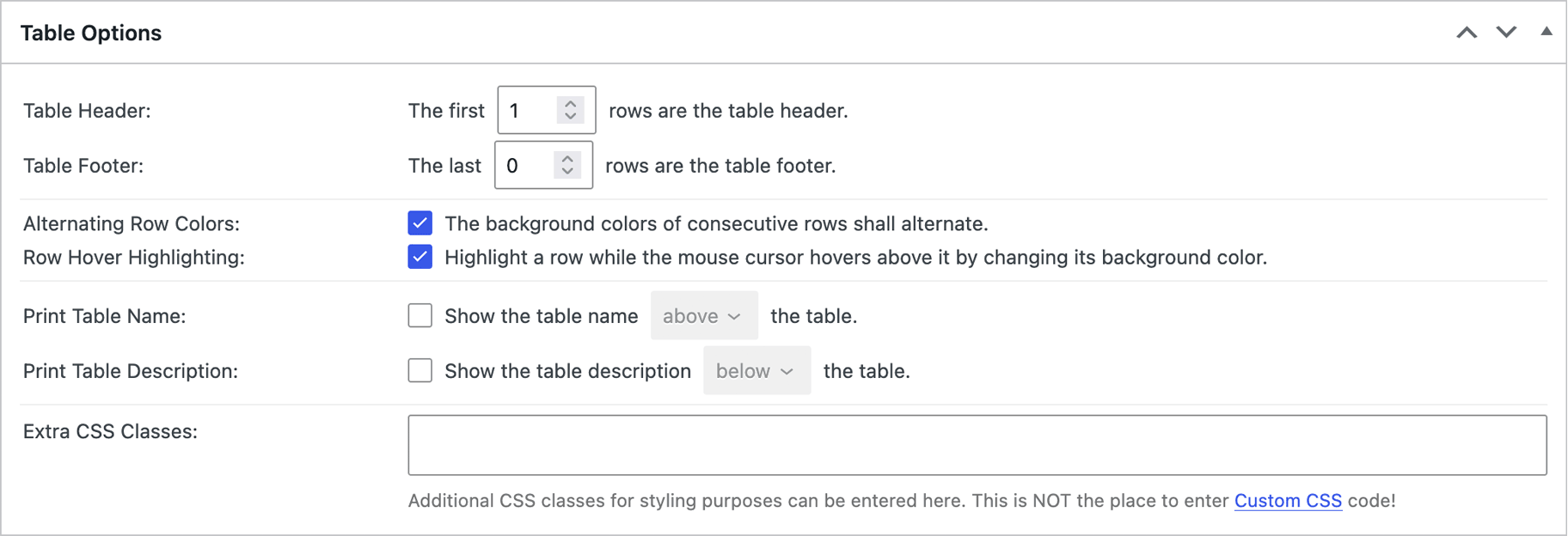
Table Structure
The “Table Header” and “Table Footer” settings define how many rows at the top or bottom of your table are treated as header or footer rows. You can recognize these rows by their different background color in the visual editor.
Header or footer rows usually contain the column titles that label the column’s contents. Many visitor-facing features, such as sorting, require at least one header row to place the interactive controls.
If your table has more than one header row, you can use the first row to group the column headings in the second row.
For example, place “Length”, “Width”, and “Height” in the second header row. Then enter “Dimensions” in the first cell of the first header row, leave the next two cells empty, select all three cells, and click “Combine/Merge” in the “Table Manipulation” box. The result is a single “Dimensions” heading spanning the three columns.
Basic Styling
These options improve readability by making rows easier to distinguish and follow. The “Alternating Row Colors” setting adds zebra striping to your table, helping visitors focus on the row they’re scanning. This is especially helpful with wide tables.
If you remember placing a ruler under lines of text while learning to read, you’ll immediately grasp the concept of “Row Hover Highlighting.” When you move your mouse cursor over a row, the entire row will be highlighted with a stronger background color. Put your cursor over any row in the table preview to see the effect.
Additional Information
Often, tables benefit from a title, explanation, or additional context on the page. For this, and for the added accessibility, you can choose to display the table’s name and description above or below the table.
Extra CSS Classes
This field allows you to assign additional CSS classes to your table for styling purposes. Know that most users won’t need this unless they want multiple tables to share the same custom styling.
CSS classes let you apply consistent styling to tables without changing their structure. They make it easy to control borders, colors, spacing, alignment, and other visual elements, while allowing multiple tables to share the same design.
By defining these styles in a central CSS stylesheet, you can update the appearance of every table using the same class from a single location. This simplifies maintenance and ensures a consistent design across your site.
Any class name entered here can be targeted by CSS code in the “Custom CSS” field under TablePress > Plugin Options > Custom Styling. Our FAQ page has a couple of examples.
Good to Know
In addition to the settings on the table’s Edit screen, all table options can be applied via the “Configuration Parameters” field in your table’s “Advanced” section in the block editor’s sidebar—as well as via the Shortcode. Note that these parameters override the settings that are applied through the table’s Edit screen. We have an extensive, searchable documentation page with all available settings.
If you’d like to change the colors of the “Alternating Row Colors” or “Row Hover Highlighting” features, the premium “Default Style Customizer” module will let you do exactly that—and more!
The table description also accepts HTML code. This allows you to format the table description should you choose to display it next to the table or to add links to it, e.g., to sources of your table data.