Great-looking tables on all devices!
Responsive Tables
Tables on websites can not always adjust to the available space on the screen automatically: Their content requires a certain minimum space, and that defines the minimum width of the table. If that minimum table width is bigger than the width of the available content area or screen, the table will not fit.
Unfortunately, this can lead to ugly behavior on small screens, like on mobile phones and tablets, where a table might be cut-off on the right side or extend into the sidebar, as in this example illustration of a table shown on a smartphone.
Besides the ugly design that this causes, this can actually prevent your visitors from seeming important information in your tables! It’s bad for search engine optimization (SEO) and accessibility as well.
Approaches for responsiveness
The Responsive Tables feature module in TablePress Pro and TablePress Max offers five approaches to solve this challenge:
For all modes, features like searching and pagination will continue to work. Sorting will be possible for all modes except the Stack mode.
Here are examples for the five modes:
Scroll mode
This mode will make a table that is too wide to be fully displayed horizontally scrollable. With that, the user can still reach all table data. This is usually a good approach for tables with images, if they don’t automatically resize.
The table can be scrolled horizontally, so that the otherwise cut-off data can be reached.
For the Scroll mode, it is also possible to show left/right arrow buttons on the left and right sides of the table, to indicate that a table can be scrolled horizontally, in addition to swiping.
And the cool thing: These buttons are only shown when a table can be scrolled horizontally. They stick to the page so that they are always visible, which makes them very helpful for long tables.
Using the Fixed Rows and Columns feature module, it is also possible to keep columns fixed to the edge of the screen.
This way, it’s always clear, what data is being shown in each row.
Collapse mode
The Collapse approach can add a hide/expand effect to a table. It will hide the data from those columns that would otherwise be cut-off and instead adds that data to a collapsible row that is inserted below each entry. That row can be shown and hidden with a “+” and “-” button. This mode is especially useful in tables that show additional information for some “main” columns, e.g. in a directory table.
Cut-off columns on the right can be shown/hidden via the “+”/”-” button in each row.
By the way: Changing the colors for the “+” and “-” buttons in the first column is very easy with the Default Style Customizer feature module!
The “Collapse” mode also works well on bigger screens and can be used to make data available that maybe doesn’t have to be visible on first glance, but offers valuable details. For that, it’s also possible to configure which columns are collapsed when the page is loaded. The following demo table is configured to collapse all but four columns:
| Last Name | First Name | Birthday | Company | Phone | ZIP code | Country | Balance | Points | Rating |
|---|---|---|---|---|---|---|---|---|---|
| Banks | Travis | 05/04/1969 | Apple | 200-4324 | 64655 | Italy | $61.17 | 8 | 6.6 |
| Cain | Lawrence | 05/16/1994 | IBM | 701-3108 | 98004 | United States | $54.81 | 5 | 2.5 |
| Middleton | Dennis | 01/10/1992 | 580-9501 | 80913 | Spain | $24.83 | 4 | 5.2 | |
| Valenzuela | Lunea | 01/09/1966 | Cisco | 970-8655 | 51606 | Germany | $74.07 | 7 | 3.7 |
| Burgess | Quynn | 09/24/1988 | Mozilla | 430-8943 | 78965 | France | $16.13 | 8 | 2.9 |
Modal mode
Similar to the Collapse mode, the Modal mode will only show columns that fit on the screen. The other data is then shown in a modal overlay when a row is clicked.
Columns that don’t fit on the screen will be shown in a modal window, also called overlay or popup, when the “+” button of a row is clicked.
By the way: Changing the colors for the “+” and “-” buttons in the first column is very easy with the Default Style Customizer feature module!
The “Modal” mode can also be used to make data available in a modal overlay, e.g. details for an table entry. It’s also possible to configure which columns are hidden when the page is loaded. The following demo table is configured show four columns, but will reveal all information after clicking the “+” button:
| Last Name | First Name | Birthday | Company | Phone | ZIP code | Country | Balance | Points | Rating |
|---|---|---|---|---|---|---|---|---|---|
| Banks | Travis | 05/04/1969 | Apple | 200-4324 | 64655 | Italy | $61.17 | 8 | 6.6 |
| Cain | Lawrence | 05/16/1994 | IBM | 701-3108 | 98004 | United States | $54.81 | 5 | 2.5 |
| Middleton | Dennis | 01/10/1992 | 580-9501 | 80913 | Spain | $24.83 | 4 | 5.2 | |
| Valenzuela | Lunea | 01/09/1966 | Cisco | 970-8655 | 51606 | Germany | $74.07 | 7 | 3.7 |
| Burgess | Quynn | 09/24/1988 | Mozilla | 430-8943 | 78965 | France | $16.13 | 8 | 2.9 |
Stack mode
The Stack mode will show the cells of a row on top of each other, instead of next to each other. This makes the table more narrow, as it will appear to have only two columns: One for the header cells and one for the original row’s data cells.
The table rows are shown as columns, so that the table is more narrow and appears to have only two columns — one for the header cells and one for the data cells. This will work nicely on small screens, but might need a lot of vertical scrolling in large tables.
Flip mode
This mode changes the layout of the table, by flipping it to the side (rows appear as columns and vice versa), and then makes the table horizontally scrollable. This mode is a good solution for plain data tables, but will usually not work nicely in tables with images, cells of different height, or with combined/merged cells.
The table is flipped to the side and can be scrolled horizontally.
Usage instructions
To use these features with your tables, activate the “Responsive Tables” feature module on the “Modules” screen of TablePress Pro or TablePress Max. Then, configure the desired options in the “Behavior on different screen sizes (Responsiveness)” section on the table’s “Edit” screen, by choosing the desired more for responsiveness.
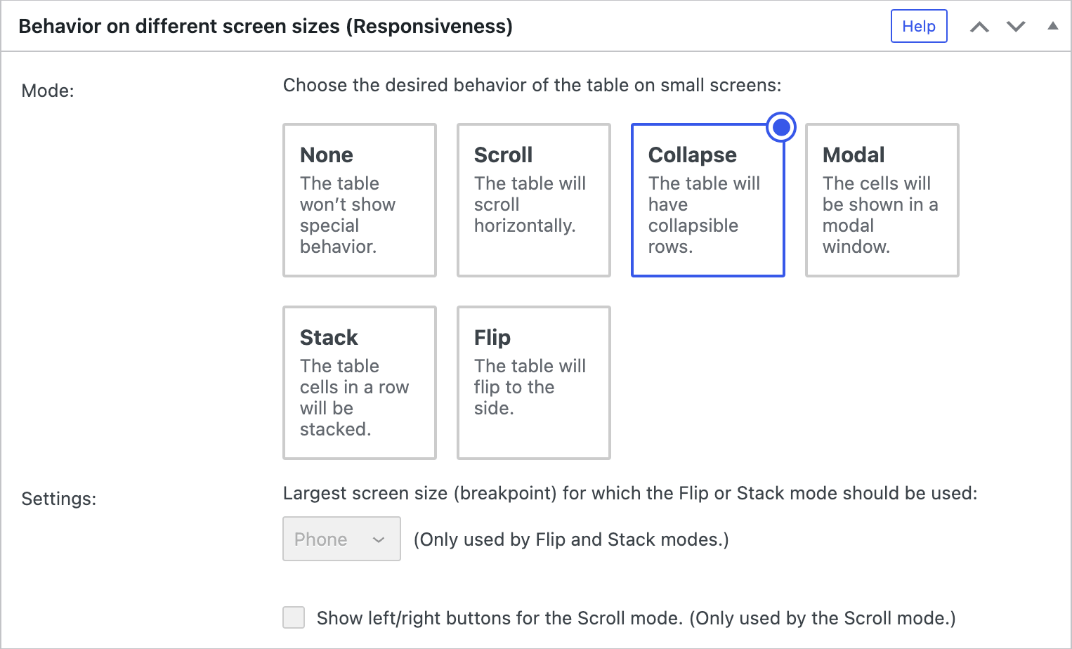
For the Flip and Stack modes, you can then also choose the biggest screen size, called breakpoint, for which you want to use the responsiveness mode instead of the original table view. Available breakpoints are Phone, Tablet, Desktop, and All, according to this list:
- Phone: The Flip or Stack mode is used only on phones (devices with a screen width smaller than 768 pixels).
- Tablet: The Flip or Stack mode is used on phones and tablets (devices with a screen width smaller than 980 pixels).
- Desktop: The Flip or Stack mode is used on phones, tablets, and medium-sized monitors (devices with a screen width smaller than 1200 pixels).
- All: The Flip or Stack mode is used on all screens, regardless of their screen size.
For the Scroll mode, you can also choose whether to show left/right arrow buttons, to indicate that the table can be scrolled horizontally.
Configuration parameters
To configure this module’s features, you can also use these configuration parameters in the “TablePress Table” block, the Elementor widget, or in the Shortcode that you are using to embed the table:
| Module | Slug | Configuration parameter | Name | Description | Type | Default value | |
|---|---|---|---|---|---|---|---|
| Responsive Tables | responsive-tables | responsive | Mode for Responsiveness | The desired behavior of the table on small screens. | enum ("" (empty string), scroll, collapsemodal, stack, or flip) | "" (empty string) |
|
| Responsive Tables | responsive-tables | responsive_breakpoint | Breakpoint for the Mode of Responsiveness | The largest screen size (breakpoint) for which the Flip or Stack mode should be used. | enum (phone, tablet, desktop, or all) | phone |
|
| Responsive Tables | responsive-tables | responsive_scroll_buttons | Horizontal Scroll Buttons | Whether to show left/right buttons for the horizontal scrolling. | boolean (true or false) | false |