Creating accordion-like table rows
How to collapse columns and make them expandable
Tables with multiple columns often don’t fit on the screen entirely. Usually this happens on smaller screen sizes, like phones and tables, but it can happen on desktop monitors as well. Solving this challenge is referred to as “making a table responsive”. The TablePress premium license plans offer the Responsive Tables feature module, which brings several different approaches to tackle this.
The popular Collapse and Modal approach can solve this by adding a hide/expand effect to a table. It will hide the data from those columns that would otherwise be cut-off and instead adds that data to a collapsible row that is inserted below each entry. That row can be shown and hidden with a “+” and “-” button, as shown in the example next to this text. This mode is especially useful in tables that show additional information for some “main” columns, e.g. in a directory table.
Cut-off columns on the right can be shown/hidden via the “+”/”-” button in each row.
By default, all columns that will fit on the screen are shown. Those that don’t fit, starting from the right, will be hidden/collapsed (but can be expanded).
It’s however also possible to specify which columns should be hidden in advance, independent from the screen size. This tutorial will guide you through that step by step.
Step 1: Activate the “Responsive Tables” module
A prerequisite for this is the Responsive Tables module, available in both the TablePress Pro and TablePress Max premium license plans.
This module is normally activated by default. To confirm that or to otherwise activate it, please go to the “Modules” screen of TablePress in your site’s WordPress admin dashboard and turn on the “Responsive Tables” module.
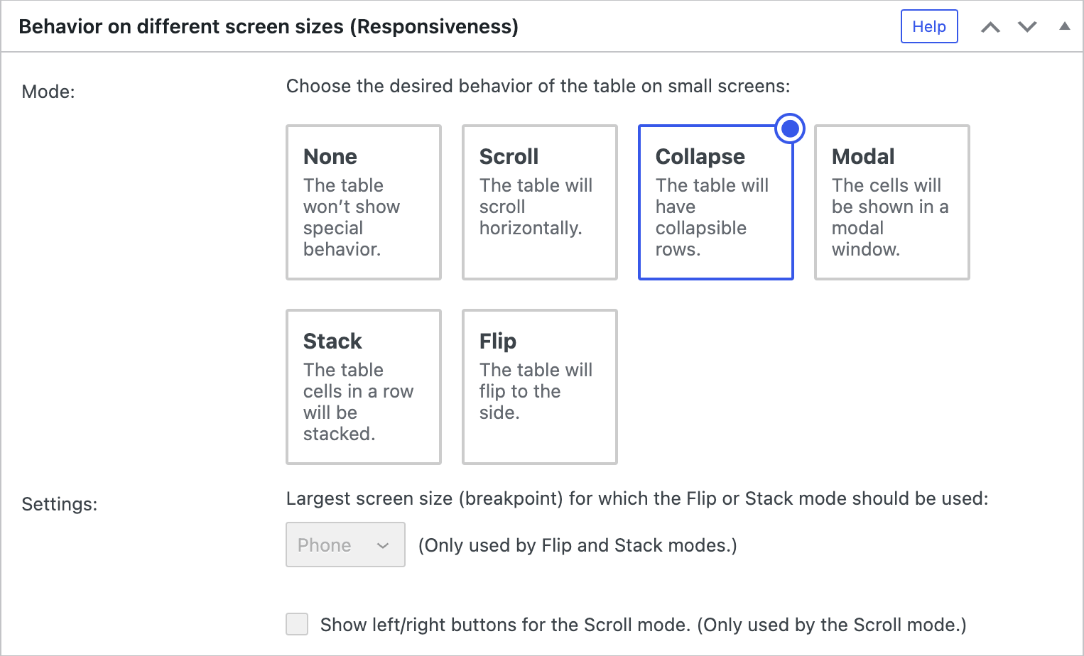
Step 2: Turn on the “Collapse” mode
Once the module is active, you’ll see the “Behavior on different screen sizes (Responsiveness)” section on the “Edit” screens of your tables. For the table for which you want to configure the collapsible rows, select the “Collapse” mode in that section, as shown in the screenshot:
Step 3: Configure the collapsed columns
After turning on that “Collapse” mode, only columns that fit on the screen are shown. Columns that don’t fit, starting from the right, will be hidden/collapsed, but can be expanded by clicking on the “+” icon.
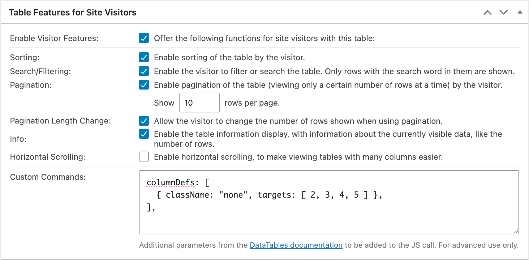
To specify which columns should be hidden/collapsed when the page is loaded, add a command like this to the “Custom Commands” text field in the “Table Features for Site Visitors” section on the table’s “Edit” screen (see the screenshot below as well):
columnDefs: [
  { className: "none", targets: [ 2, 3, 4, 5 ] },
],Code language: JavaScript (javascript)
This example will hide columns 3 through 6 (indicated by the 2, 3, 4, 5, as counting the columns starts with 0 for the 1st column in this type of code), and will make them expandable, regardless of the screen size.
It is also possible to configure columns to be visible on all screen sizes, meaning that they will never be collapsed. For that, use the keyword "all" in the className setting in the command, like
columnDefs: [
  { className: "all", targets: [ 1, 6 ] },
],Code language: JavaScript (javascript)
which would ensure that columns 2 and 7 will always be shown as normal columns.
It is also possible to combine these commands, to apply different instructions to different columns, like this:
columnDefs: [
  { className: "none", targets: [ 2, 3, 4, 5 ] },
  { className: "all", targets: [ 1, 6 ] },
],Code language: JavaScript (javascript)
For more fine-grained control, even more values for the className setting are available in the documentation of the used JavaScript library.
So, to configure which columns to collapse, simply adjust the value of the className and the numbers for the columns in the command, taking into account that “minus 1” rule for the column numbers.
Example
Here is an example of a table for which collapsible and expandable columns shall be defined manually. The table data, here shown on its “Edit” screen looks like this:
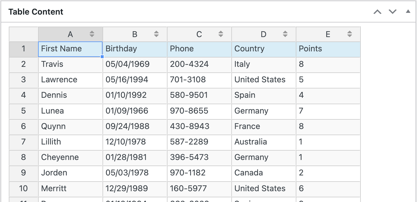
Below, this table is embedded and configured so that its second and third columns will always be collapsed and are expandable by clicking on the “+” icon. The fifth column will always be shown. The remaining columns (1 and 4) will only be shown if they fit on the screen and will be collapsed otherwise.
| First Name | Birthday | Phone | Country | Points |
|---|---|---|---|---|
| Travis | 05/04/1969 | 200-4324 | Italy | 8 |
| Lawrence | 05/16/1994 | 701-3108 | United States | 5 |
| Dennis | 01/10/1992 | 580-9501 | Spain | 4 |
| Lunea | 01/09/1966 | 970-8655 | Germany | 7 |
| Quynn | 09/24/1988 | 430-8943 | France | 8 |
| Lillith | 12/10/1978 | 587-2289 | Australia | 1 |
| Cheyenne | 01/28/1981 | 396-5473 | Germany | 1 |
| Jorden | 05/03/1978 | 970-1182 | Canada | 2 |
| Merritt | 12/29/1989 | 160-5977 | United States | 6 |
| Brynn | 01/13/1994 | 663-6039 | Spain | 9 |
The “Custom Command” to achieve this behavior is
columnDefs: [
  { className: "none", targets: [ 1, 2 ] },
  { className: "all", targets: [ 4 ] },
],Code language: JavaScript (javascript)